
Reading charts
Studying charts is part of the broader method of technical analysis which is the study of historical prices and patterns that could help in predicting future outcomes. While technical analysis involves different elements, reading charts is the basis and foundation of technical analysis. Before learning to analyze patterns and formations, traders need to learn to look at a chart and understand the general sentiment behind price for a specific period.
Like anything else in life, watching charts and practicing potential outcomes helps technical traders in becoming more proficient when it comes to technical analysis. While charts may look obvious and certain trends can look well established, the reality could be different and market conditions can abruptly change.
Understanding trends
If one was to look at a general chart, one will easily be able to identify an uptrend or downtrend if the price has been moving up from one corner to the other or vice versa. More specifically, a series of higher highs and higher lows denote an uptrend while a series of lower highs and lower lows denote a downtrend. When markets are not trending, the price may be showing consolidation and a more sideways action which could confuse traders into thinking new trends are starting, when in fact, traders are loading up or selling already owned positions which is creating a balance across the market.
Types of trading charts
Line chart
The line chart (Figure 1) is a series of closing prices drawn over some time and updated in real-time, depending on the timeframe of choice. In other words, the line chart shows you the closing price for a specific hour, day, week, or any timeframe you may be interested in analyzing. You may be asking why we are referring to the closing price, something that we will discuss later on but briefly, the closing price is seen as the most important piece of information that traders wait for and can help hint at how traders feel about a certain instrument for that period.While it may not present other important data, some traders may choose to focus on the closing price online, filtering out what they believe is noise and unnecessary data and may still be able to trade successfully and profitably.

Figure 1 15-minute GBP/NZD Line Chart
Please click For bigger size
Bar chart
Bar charts help visualize more data during a specific period. This type of chart shows the open, high, low, and close for that timeframe and may be more beneficial for traders who use this information to support their trading decisions. For example, a trader may focus on how high the price went if the closing was much lower or even below previous bars. All of this information could help gauge sentiment and reveal hidden elements that experienced traders can pick up by studying those charts.
The high and the low are presented by a vertical line while the open is found as a dash connected from the left side of the bar with the close found on the right side.
Candlestick chart
Charts
Candlestick charts (Figure 2) are very similar to bar charts and, in fact, show exactly the same information but are visualized in a different manner. With candlesticks, the open and close are drawn as a closed body which could take on a rectangular or square shape. The highest price of the timeframe, if higher than the open or close of the candle will look like a small bar at the top while the lowest price of the timeframe, if lower than the open or the close, will look like a small bar at the bottom. Sometimes the high may coincide with the open or close of the candle which is also possible for the low of the timeframe.
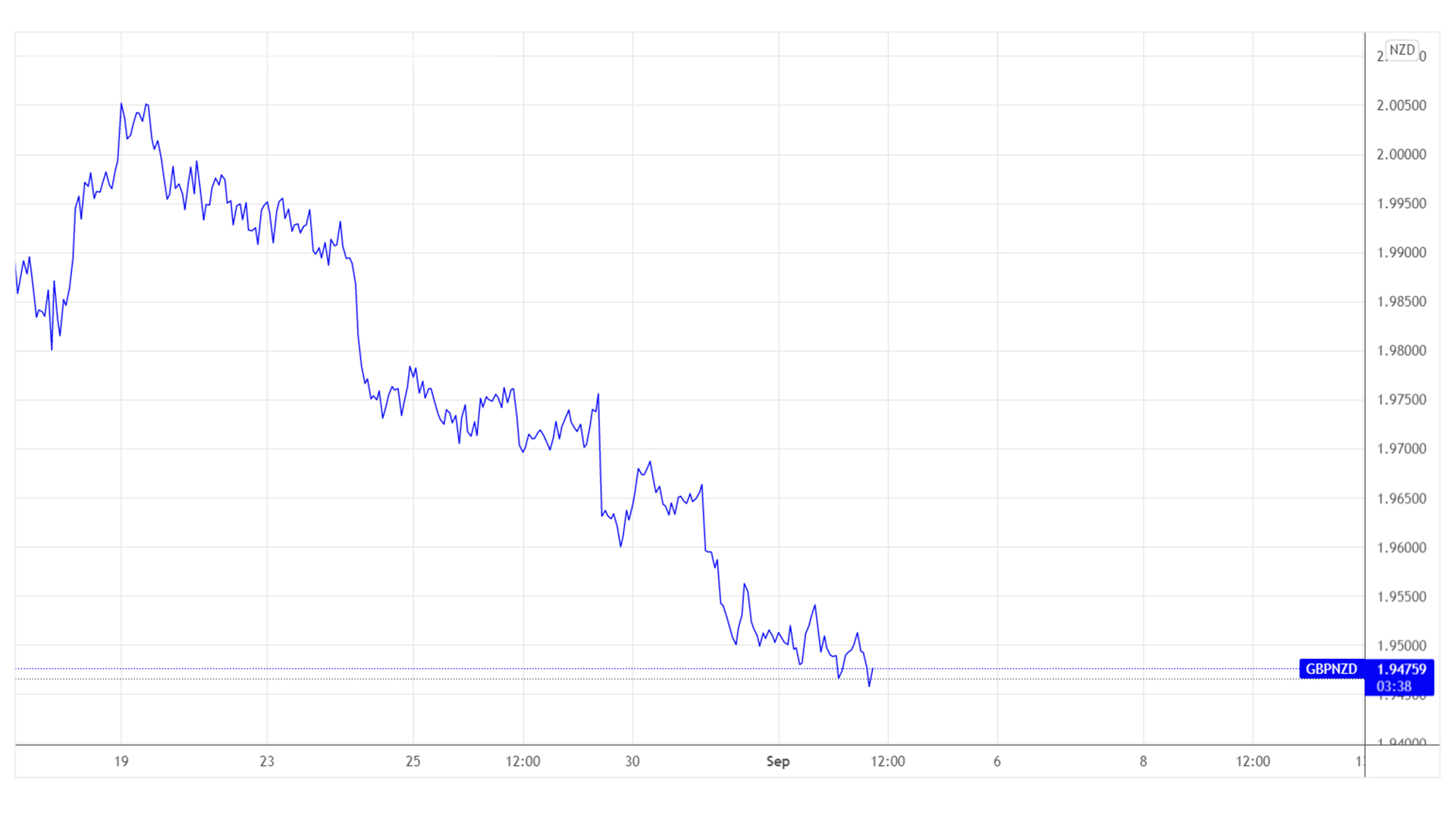
Figure 2 1-hour GBP/NZD Candlestick Chart
Please click For bigger size
Graphical analysis
Technical analysis and the study of charts is a very broad topic that includes hundreds and thousands of different analytical perspectives that traders can learn and develop on their own. Many trading systems and some that are highly successful were developed by ordinary traders who spent endless hours looking for a certain edge in the market. It’s never an easy endeavor and no trader out there can win every single trade but with enough patience and experience, you can learn or develop certain patterns and formations that can prove profitable when traded in conjunction with proper risk management parameters.
Candlestick patterns
Starting with candlesticks, each price during a specific period or timeframe can reveal a pattern on its own. A candlestick that closes much higher than it opens but with a prominent low price due to early weakness may denote buying pressure while another similar candle with no early weakness may show even stronger buying pressure. A candle that opens and closes around the same price could mean indecision as buyers and sellers fight to gain control and push towards a specific direction.
Some patterns may form over 2 or 3 candles. Again, logic plays an important role here in that a candle that closes much lower than it opens and one that is showing weakness may actually be a reversal in the making if it is followed by two positive candles that could bring back the price to where the original candle opened up.
While it may sound easy at times, trading requires patience, discipline, trained observation, and someone who is dedicated to finding a successful approach that could navigate the dynamism of the markets
Moving on towards broader formations, more sophisticated patterns may include price variations (Figure 3) over a longer period where different candlesticks or bars may create certain patterns that have proved to create a specific outcome in the past with relatively high accuracy. For example, if the price is moving sideways with minor ups and downs over some time, this could be seen as indecision with both buyers and sellers fighting for control. This is similar to a candlestick that has no real body and with the open and close around the same price. Another example would be price contracting in a triangle pattern, indicating traders are still fighting for the direction and the fight is getting closer as the competition becomes very close.

Figure 3 1-hour GBP/NZD Channel with parallel lines
Please click For bigger size
Price and candlesticks together
During periods of consolidation and ranging conditions, traders may look for temporary tops as defined by where the market is finding resistance and moving lower and may look for bearish candlestick patterns near that resistance. The opposite is true with traders looking for positive candlestick patterns near the support of a consolidation area. Effectively, traders are now finding a pattern within a pattern, increasing their chances of success.
This is a straightforward approach to helping traders find high probability, low risk, and high reward trades but the variations are many which is why traders need to spend many hours studying or simply selecting certain patterns they believe suit their trading personality and characteristics.
Confluence and multiple confirmations
Once the broad pattern is defined, traders will move to find a good entry point on a specific timeframe. Those who are extra picky and looking for a better risk-to-reward ratio may drop the timeframe further, pinpointing a smaller candlestick formation that would serve as another confirmation for the trade. Indeed, this is the smarter way to trade and many would continue to get micro in their approach although this may become exhausting for the average trader and may not make much of a difference after a while.
Nonetheless, the more confirmation present for a trade, the more likely it is to reach its target while keeping risk low and in the event, a trader does not work out, the risk would be relatively small compared to the potential of the next opportunity.
Indicators
Technical indicators are based on formulas that can help visualize price in a variety of ways. Indicators are not extra special and in fact, derived from price. Nonetheless, they help traders better understand how the market is behaving when used properly.
Indicators include the following:
Trend indicators such as moving averages (Figure 4) will help traders better visualize the current trend as well as find patterns between the price and the period used for the moving average. The slope might show an uptrend or a downtrend while price holding around the moving average could indicate support or resistance.
Momentum indicators
Momentum indicators help traders better understand when a market is trending up or down but also, to a certain extent, when a market is overbought or oversold. Now those two concepts are not easy to differentiate as a trending market may look healthy and set to continue but if the conditions are right, contrarian traders may be waiting for the right signs to reverse a certain market. When used in conjunction with trend indicators and other patterns, they can help show if the trend is set to continue or a reversal is on the way.

Figure 4 1-hour USD/CAD Chart with 55 period moving average
Please click For bigger size
Volatility indicators
Volatility indicators (Figure 5) are an important piece of the puzzle as they can give traders an idea of how volatile the market is. Is the range expanding? Has the market recently made a sharp move up or down? Is the market trading in a tight range in anticipation of a major event that could lead to a price explosion? Those are important questions to ask and volatility indicators may coincide with worldly events to give an idea of future range expectations
Volume
Volume plays a major role in understanding the force behind a move. A surprise move higher on strong volume could mean a well-established trend is about to begin but low volume may indicate a potential surprise in the market. A small candle with a big volume could mean a strong fight with a breakout coming up next. Understanding volume from a context point of view could help traders learn more about the real steam behind a move.
Market cycle indicators
Among the most popular cycle indicators or strategies are Elliott Waves which focuses on the idea that the market is either in an impulsive state or a corrective state. A simple way of looking at it is to wait for a strong bullish or bearish move then wait for the correction in the opposite direction before the original trend resuming. It’s not always as simple as that but the idea is simple enough for people to build somehow profitable strategies around it.

Figure 5 4-hour USD/CAD Chart with Average True Range Indicator
Please click For bigger size
Putting it all together
There’s no right or wrong when it comes to analyzing charts. Many traders use unusual and intuitive-driven methods of predicting future price action while others may look at traditional and online-taught strategies of trading. Each one of us has a unique character and risk tolerance and this helps define what we feel comfortable using, in order to create success in the financial markets. It’s worth noting that looking at multiple timeframes or finding multiple confirmations for a trade may increase the odds of it being successful and longer timeframes tend to generate clearer and bigger opportunities to trade among other general considerations. Whatever method you decide to focus on, always keep strong risk management guidelines in mind as trading is not gambling and should be treated as a business with ups and downs.