
Most traders, regardless of their experience level, risk tolerance, or style of trading use or have used technical analysis to make trades or at least analyze the market. The importance of it is undeniable which means that learning at least the basics is a must for any individual involved in the financial markets.
As trends alternate and shift from up to down and vice versa, those boundaries are usually defined by price patterns that signal this shift. Price patterns can indicate a completely new direction in the market, known as reversal and continuation patterns that arise after different forms of consolidation in the price within well-established trends.
Trendlines
One of the most important aspects of technical analysis is determining the trend of a financial product. In this case, trendlines are known to be a very simplistic but highly useful tool to visually help traders see how a trend is developing. Trendlines are also great at identifying support and resistance levels.
For those who are not familiar, trendlines are straight lines (Figure 1) that connect descending price tops or ascending price bottoms. If an asset is in a bullish trend, the price action will most likely enable you to draw a straight rising line that connects multiple points. The same applies to a bearish trend where the tops should be descending and allow you to draw a down-sloping trend line that connects those tops.
(Figure 1)
Think of it as a “connect the dots” concept yet, in reality, the price action of an asset will not always be this clear and straightforward. At times, you might observe price briefly crossing a trendline only to reverse shortly after which is why it is important to keep an open mind when using trendlines for analysis and entry purposes.

Figure 1 - 1-hour US OIL with trendlines chart
Please click For bigger size
Trendlines are also highly subjective with some traders using highs and lows of a candlestick or specific period while others may choose the open and close of a candlestick to draw the straight lines.
One final aspect to note is that trendlines should connect two or more points with a three-point trendline providing stronger validity and could be more reliable to trade in terms of continuation or invalidation. It’s worth noting that just because a trendline has 3 or 4 connected points it does not mean that future price points will stop at exactly the trendline’s projected price. This is part of the idea that the market is not perfect in how it moves and the noise created, especially on intraday charts could be misleading to those who do not have enough experience.
Continuation Patterns
During established trends, the price may occasionally take a break, attributed by traders likely closing positions when they believe they have reached their targets or that the market is currently exhausted. These are referred to as corrections and in the technical analysis world, continuation patterns, a definition that hints that the market will continue its original trend soon.
Corrections during trends are not identified as continuation patterns until price action confirms this. At times, a trend may be well-established and then a correction takes place which suddenly turns into a reversal.
Most traders will assume a trend is set to continue before thinking that a reversal is possible which is why it is important to assess the significance and characteristics of the correction or continuation patterns.
A rule of thumb is the longer it takes and the larger a price pattern is during the assumption of a correction, the bigger and more significant the continuation move will be once the trend resumes.
There are a few important and easy-to-spot patterns that, when proved as valid and highly probable, could lead to a clear continuation of the price within the established trend.
Pennant
Sometimes a correction is orderly, showing a mini-trend in the opposite direction of the original one while at other times, the correction could be converging, broadening, or completely sideways and horizontal.
A pennant is a series of two converging trendlines (Figure 2), indicating a correction that is tightening in range with price eventually breaking out of the consolidation. Volume tends to decrease as no new trades are initiated except for some profit bookings taking place.
Pennants are relatively easy to spot, discounting the probability that they are indicating continuation or a reversal. The right trendlines will lead prices to a tipping point where prices should break out in the direction of the original trend. Otherwise, the price will fail and continue sideways or in the opposite direction.

Figure 2 – 5-min US OIL pennant pattern chart
Please click For bigger size
Flag
A flag is another continuation pattern that is described as a mini-trend against the main trend. It resembles a flag with two parallel lines constricting prices in a slightly angled consolidating manner (Figure 3). The end result is either price will break out in the direction of the main trend or simply fail sideways or in the opposite direction.
Again, the volume may decrease during the formation of a flag pattern and will increase when the breakout does take place.

Figure 3 – 5-min US OIL flag pattern chart
Please click For bigger size
Wedge
A wedge resembles a pennant except that the trend lines are moving in the same direction yet converging (Figure 4). In other words, a wedge is a large consolidating formation that is taking some time to become established and ready for its next stage.
In the case of an uptrend, a wedge will show two slowly converging lines downward despite their varying degrees. The opposite is true for downtrends.

Figure 4 – 5-min US OIL flag pattern chart
Please click For bigger size
Triangles
A frequently occurring pattern, triangles are characterized by two converging lines similar to a pennant. Triangles are three types: Symmetrical, ascending, and descending.
Symmetrical triangles signal that a breakout is likely to occur although the direction is unclear as triangles are either part of a consolidation within a larger trend or the end tail of an ongoing consolidation.
Ascending triangles (Figure 5) will have a flat upper trend line and an ascending bottom one, showing clearly that the price is making higher lows while facing resistance. Ascending triangles are highly indicative of a breakout higher and are fairly reliable.
Descending triangles will have a flat trendline at the bottom and a descending upper trendline, indicating a breakdown is very possible, similar to how ascending triangles are.
Different factors come into play such as how big the triangle is or how spaced out the price points are which could give a hint into the expected future move.

1-hour Nasdaq ascending triangle pattern chart
Please click For bigger size
Cup and Handle
The cup and handle pattern is not as common as others and is not taken as seriously although it's highly reliable when spotted correctly. It is a bullish pattern where the price moves in a “U” shape followed by a small pullback towards the low of the “U” shape. This pullback is carefully watched as a break above it could validate the entire pattern and lead to a new impulsive move higher.
Reversal Patterns
Certain price patterns occur over a certain period that could indicate a change in trend. Basically, when a trend is close to its limit and is beginning to run out of steam, the price action may become more erratic and opposing forces may begin to manifest themselves in the form of bigger corrections or sharper mini-reversals.
Head and Shoulder
This is a classic reversal pattern that may occur at market tops or bottoms in the form of 3 pushes. Initially, and assuming an uptrend, the market will push higher then correct briefly lower before pushing above the first high to form a larger top. The final stage of the pattern will be almost parallel and symmetrical to the first push with a high that fails to overcome the middle and highest swing. At this point, traders will want to watch the support area that marks the beginning of each of those impulsive moves that formed the swing highs. As soon as that area is invalidated and the price begins to move below it, the trend is likely reversing with an expected new range that is equal to the distance between the support area and the top of the pattern which is the recent highest high.
Head and shoulder patterns are called that way for a reason: They look like the shape of humans with two shoulders and the head that is above both.
Head and shoulders can also form in downtrends and would behave opposite to the above which describes the pattern in an uptrend that is ending.
Double tops/bottoms
Another powerful reversal signal occurs when the market fails multiple times to break a resistance or support level. The double top pattern is shown as two or more highs that are failing at around the same level and may look like the letter “M”. The more attempts, the more powerful the area of resistance is.
The same applies to double bottoms (Figure 6) which look like the letter “W” and indicate an area of support that is hard to break.
When describing more than two tops, the pattern is referred to as “Triple Top” which indicates three failed tops, and beyond that, the area is just described as a powerful resistance zone. The opposite is true for “Triple Bottoms”.
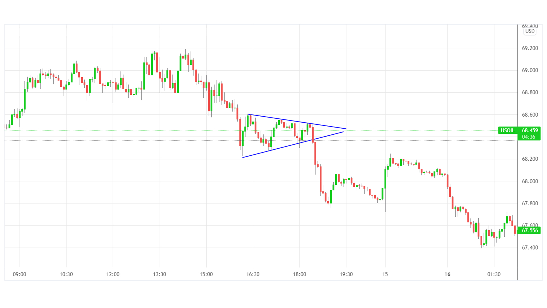
Figure 6 – 4-hour EURAUD double bottom pattern chart
Please click For bigger size
Market gaps
Gaps form when the price of a financial product closes at one price and opens at a completely different price. The empty space in price action is referred to as a gap. Gaps are three types, a breakaway gay, a runaway gap, and an exhaustion gap.
They are all similar in how they look but breakaway gaps are ones that are usually found after an extended downtrend and form when the price opens significantly higher from where it closed. This marks the beginning of a new uptrend or at least, a correction.
Runaway gaps are momentum gaps that form in the middle of the trend and usually give an indication that the trend is still going strong, whether it's an uptrend or a downtrend.
Exhaustion gaps form at the end of a trend and in the direction of the trend. Price may be trending higher for a while but the trend is showing signs of exhaustion. Suddenly, price gaps into new highs but reverses over the course of a specific period to show that it was never a true breakout. In this case, the market is signaling an end to the uptrend and a move lower is likely to manifest itself shortly afterward.
The opposite is true for exhaustion gaps that occur after an extended downtrend.
Final Thoughts
Regardless of your preferred method or strategy, price patterns are another set of tools to add to your trading arsenal. Those patterns on their own are enough to provide low-risk and highly rewarding trades and when coupled with other important aspects related to successful trading, they can help anyone improve their trading towards consistency.
Start with determining the trend then look for continuation patterns to form so you can join the trend. If you believe signs of exhaustion are showing, look for reversal patterns to try and benefit from a potential reversal or even a correction.