CFDs are leveraged products that incur a high level of risk. Know more

- Accounts
 Trading DetailsCFI AIHelp & Support
What is Technical Analysis
Death crosses in technical analysis
August 15, 2024

Introduction
Stock prices move randomly over the short-term, but over the longer-term, the randomness decreases significantly. Market prices move in trends. Technical analysis tools help traders identify these trends.
Death crosses help determine a change in market trends by analyzing moving averages. Some of the crossovers between moving averages are closely followed by traders, such as the golden and death crosses.
What are moving averages?
A moving average is the average of a range of prices of an asset over a given period. Moving averages are calculated by finding the arithmetic mean of an asset’s closing. This means summing the prices in the set and then dividing that sum by the number of price points you have.
The most common time periods are 10, 50, 100, and 200 days. Moving averages (also known as just MA) are plotted alongside prices on a price chart where the x-axis reflects the time and the y-axis reflects the price, as shown in Figure 1. Moving averages form smooth lines in contrast to the patterns formed by the price which are spiky.
Figure 1
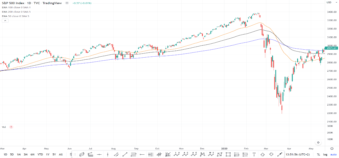
Moving averages follow prices in an uptrend, 50 MA moves above 100 MA and 200 MA, and in the downtrend, 50 MA moves below 100 MA and 200 MA. When these averages intersect, traders can anticipate changes in asset’s price direction.
What is a death cross?
The death cross pattern appears when a short-term moving average drops below a long-term moving average. Typically, the 50-day moving average and the 200-day moving average are used to identify a death cross, as seen in Figure 2.
Figure 2
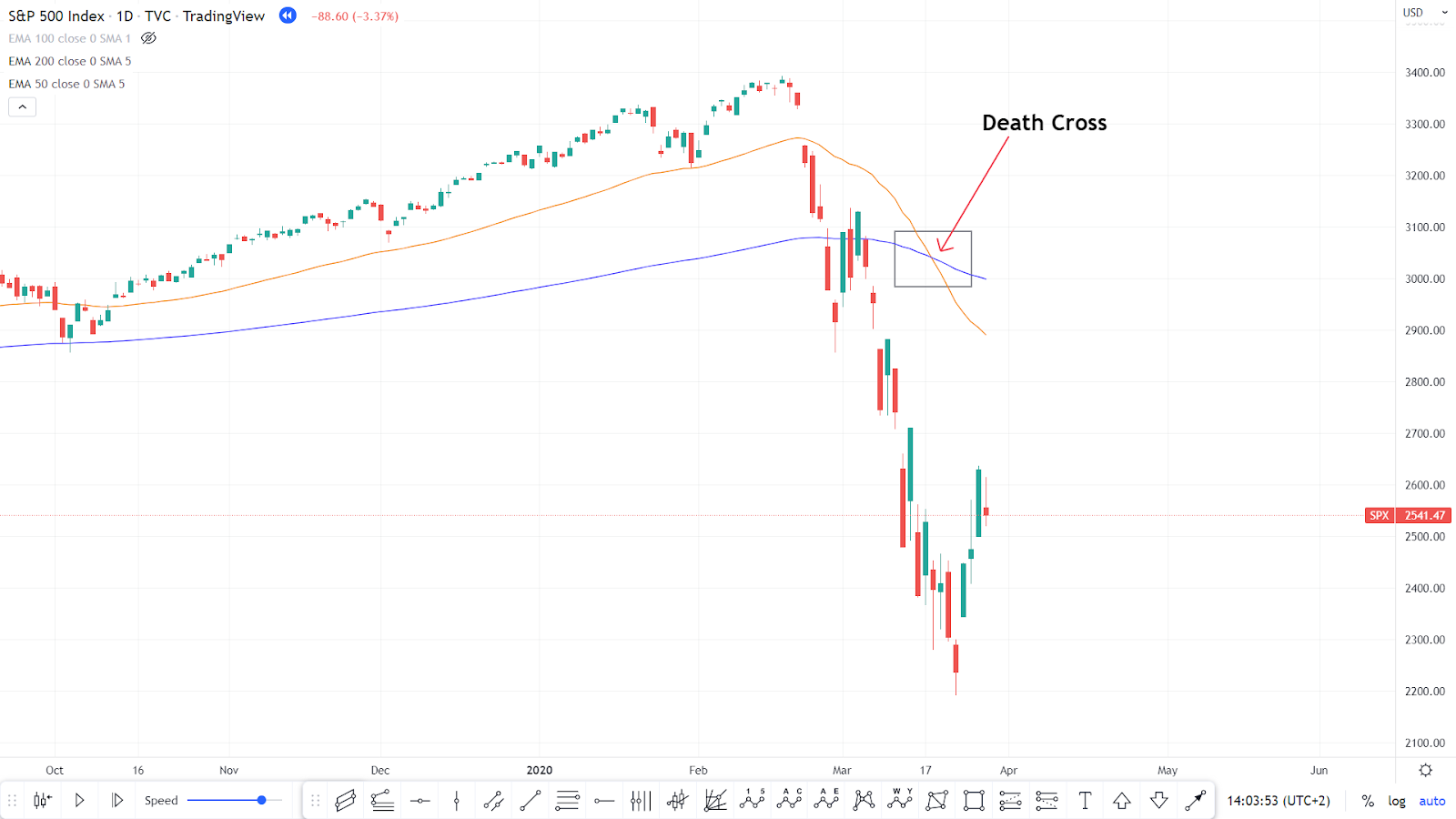
The appearance of a death cross indicates a decline in short-term momentum and a trend toward lower prices. This tells you that the short-term trend is much weaker than the long-term trend, so the market can be considered bearish. The death cross is the exact opposite of another chart pattern known as the golden cross.
Death cross and the bear market
A death cross has appeared before all the most severe bear markets over the course of the last 100 years. This includes the bear markets of 1929, 1938, 1974, and 2008. However, death crosses have also appeared when the market has only suffered a correction, meaning the market dropped by at least 10% but less than 20%.
Death crosses can appear in all assets, not only in major indices such as the S&P 500. Figure 3 shows that Apple’s stock had a death cross in December 2018, then declined more than 18% after that death cross.
Figure 3
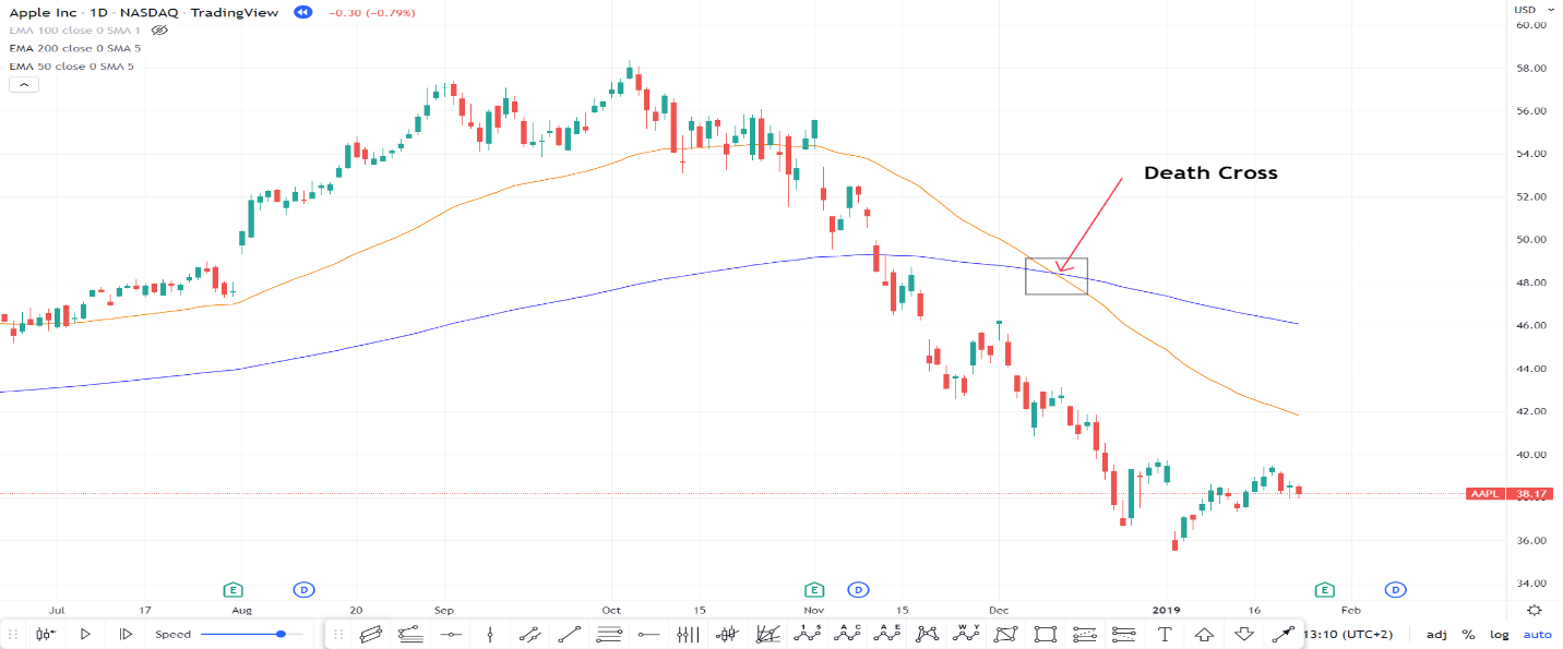
Figure 4
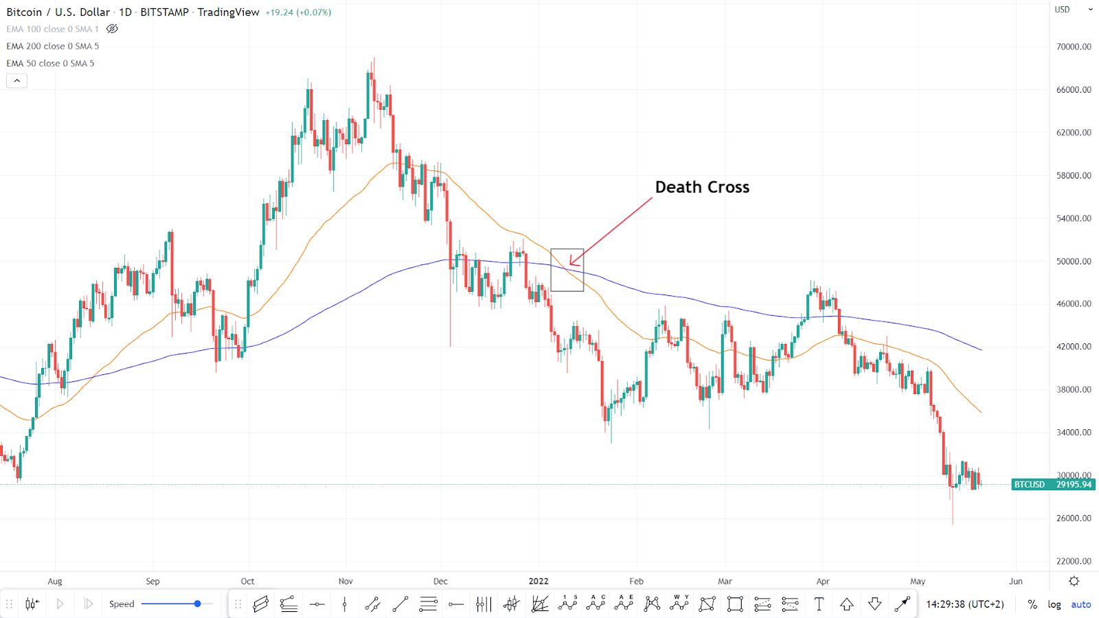
Bitcoin had a death cross in January 2022, then fell by 33% after that signal, as seen in Figure 3. To summarize, the death cross happens when a bullish trend reverses and a bearish trend is underway. It can take some time for it to print, depending on how close the two moving averages are. In general, the steeper the bullish trend, the longer it will take for a bearish cross to happen once the price starts reversing.
Limitations of the death cross
The death cross is that the pattern sometimes won’t show up until a security’s price has fallen well below its peak. To alter a death cross calculation to see the downtrend a little sooner, some investors say that a death cross occurs when the security’s trading price (not its short-term moving average) falls below its 200-day moving average. For experienced traders, investors, and analysts, a death cross pattern for a stock is most meaningful when combined with, and confirmed by, other technical indicators.
The death cross is a lagging indicator, so in some cases, the bearish times it forecasts may have already happened. When a death cross isn't backed up by other technical indicators, it may be a sign of a short-term downtrend, and investors may want to "buy the dip."
Successes of the death cross
According to Fundstrat research cited in Barron's, the S&P 500 index was higher a year after the death cross about two-thirds of the time, averaging a gain of 6.3% over that span. That's well off the annualized gain of 10.5% for the S&P 500 since 1926 but hardly a disaster in most instances.
The track record of the death cross as a precursor of market gains is even more appealing over shorter time frames. Since 1971, in 22 instances where the 50-day moving average of the NASDAQ Composite index fell below its 200-day moving average were followed by average returns of about 2.6% over the next month, 7.2% in three months, and 12.4% six months after the death cross. That’s roughly double the typical NASDAQ return over those time frames, according to Nautilus Research.
Disclaimer: The content published above has been prepared by CFI for informational purposes only and should not be considered as investment advice. Any view expressed does not constitute a personal recommendation or solicitation to buy or sell. The information provided does not have regard to the specific investment objectives, financial situation, and needs of any specific person who may receive it, and is not held out as independent investment research and may have been acted upon by persons connected with CFI. Market data is derived from independent sources believed to be reliable, however, CFI makes no guarantee of its accuracy or completeness, and accepts no responsibility for any consequence of its use by recipients.
Related Articles
See All


